Did you know that business card design influences up to 90% of a person’s first impression of you and your company, according to UPrinting? Colors alone can improve brand recognition by 80%, with 85% of buyers’ purchase decisions influenced by color. Your business card isn’t just a contact information exchange, but a powerful psychological branding tool.
The psychology of color has been a topic of interest since 1666, when Sir Isaac Newton discovered the color spectrum. Business card colors, shapes, and layouts all work together to create subconscious associations in the minds of recipients. Additionally, a colorless business card is ten times more likely to be thrown away, showing how crucial these design elements are to your professional presentation.
Whether you’re exploring business card design free tools or considering business card design with QR code options, understanding the psychological impact of each element will help you create a card that builds trust, communicates professionalism, and leaves a lasting impression.
The Psychology Behind First Impressions

First impressions in business settings form at lightning speed, typically in less than a tenth of a second. This rapid assessment stems from our evolutionary past, when quick judgments were necessary for survival. These split-second evaluations significantly affect future interactions with potential clients or partners.
1. Why first impressions matter in business
The psychology behind these rapid assessments reveals their importance. Our brains operate on the “primacy effect,” where initial information influences all that follows. Nearly 39% of people won’t do business with someone who presents a “cheap-looking” business card.
People are also 90% more likely to trust someone who provides a business card during an initial meeting. Trust lies at the foundation of business relationships. Maintaining strong brand consistency through such moments can increase revenue by up to 33%.
2. How business cards act as silent brand ambassadors
Business cards serve as tangible symbols of brand reliability. This physical exchange forms a connection that digital tools can’t replicate. These modest pieces of cardstock work as “unsung brand ambassadors” that communicate professionalism. About 72% of consumers say exchanging cards in person boosts how they perceive a company’s professionalism.
3. The role of design in building trust and recall
Design builds credibility. Around 78% believe a well-designed business card improves brand recall. Cards with logos have a 33% higher recall rate.
Color Psychology in Business Card Design
Color psychology plays a pivotal role in how recipients perceive your business card. Dating back to the early twentieth century, when Carl Jung studied color effects on the human mind, this psychological principle has evolved into a marketing cornerstone. According to Virtual Print, color influences up to 90% of initial impressions, making your palette a critical component of brand perception.
1. Blue: Trust and professionalism
Blue consistently ranks as the most popular color choice for business cards, particularly in corporate settings. This preference isn’t coincidental, and blue evokes feelings of stability, competence, and trustworthiness. It’s especially effective for financial advisors, corporate executives, and law firms where building client confidence is essential. Darker blues communicate authority and conservatism, while lighter shades suggest creativity and openness.
2. Red: Energy and urgency
Red commands attention instantly. This dynamic color stimulates appetites and provides a physical burst of strength. Although red may degrade analytical reasoning, it communicates passion, energy, and boldness, which is ideal for tech startups, restaurants, or brands requiring immediate action. However, use red strategically as accents rather than backgrounds to avoid overwhelming the recipient.
3. Black: Sophistication and luxury
Black business cards convey power, formality, and timeless elegance. According to Printivity, approximately 42% of consumers associate black with high-quality products, making it an ideal choice for luxury brands, fashion businesses, and executives aiming to project sophistication. Pairing black with metallic elements like gold or silver accents creates a striking, memorable impression that reinforces your brand’s premium image.
4. Green: Growth and sustainability
Green symbolizes balance, prosperity, and natural harmony. Research indicates that brief exposure to green enhances creative thinking, making it ideal for wellness centers, environmental brands, and financial services focused on growth. The versatility of green spans from dark tones suggesting wealth to lighter shades conveying freshness and eco-consciousness.
5. Matching colors to your brand identity
Align your color choice with your brand’s core values and personality. Consider industry standards while seeking opportunities to differentiate. For established brands, maintain consistency by incorporating existing brand colors in your business card design.
6. Cool vs. warm tones: Emotional triggers
Cool colors (blues, greens) generally create calming, trustworthy impressions, whereas warm colors (reds, oranges) generate excitement and emotional intensity. This temperature contrast helps strategically communicate your brand essence, so choose cool tones for professional services requiring trust or warm tones to stimulate action and enthusiasm.
Shapes, Layouts, and Business Card Size
Your business card’s shape, layout, and size do much more than organize information; they send unconscious signals to recipients about your brand identity. Each element creates a distinct personality impression that can significantly impact brand recall and perception.
1. Standard vs. custom shapes: What they signal
The rectangular business card has dominated professional exchanges for good reason. According to UPrinting, this traditional shape projects stability, strength, and professionalism. Rectangles naturally convey efficiency and adherence to business norms, making them ideal for conventional industries like finance, law, and corporate environments.
Alternatively, custom-shaped cards serve as powerful differentiation tools. Rounded corners or circular designs project friendliness, unity, and positive emotional messages. Square cards (typically 2.5″ x 2.5″) create a modern, bold impression, emphasizing design elements.
Be strategic with custom shapes: Die-cut business cards in unique shapes can highlight your brand brilliantly, but remember, they may not fit standard holders. Consider whether the novelty outweighs potential functional limitations.
2. Vertical vs. horizontal layout psychology
The choice between vertical and horizontal orientation carries subtle psychological implications. Horizontal layouts represent the safe, traditional choice, signaling reliability and convention. Moreover, they fit properly in standard card holders and racks.
Vertical cards, meanwhile, appear unconventional and memorable. From a design perspective, they excel at showcasing short bits of information and vertically-oriented logos. This orientation creates immediate visual interest, which is helpful at networking events where standing out matters.
3. Whitespace and symmetry: Clean design builds trust
Proper use of white space (negative space) serves as a crucial trust signal. According to design principles, cluttered cards with excessive text create visual fatigue and diminish perceived professionalism.
When you balance elements with adequate breathing room, you demonstrate sophisticated design sensibility. White space simultaneously separates and groups information, making content more digestible. This strategic spacing creates a visual hierarchy that guides the reader’s eye to important details first.
4. Business card size: What’s standard and why it matters
The North American standard business card size (3.5″ x 2″) has endured since the late 1800s because it perfectly balances portability and functionality. This size fits wallet, credit card slots, and business card holders while providing adequate space for essential contact information.
European standard dimensions differ slightly at 85mm x 55mm, marginally longer and narrower than North American cards. This subtle size difference can impact perception in international business settings.
The psychology behind card dimensions impacts how recipients value your offering. Oversized cards project confidence but may prove impractical for storage, while undersized cards appear quirky yet risk compromising information clarity.
Fonts & Typography Psychology in Business Card Design
The typography you choose for your business card communicates volumes about your brand before a single word is read. Your font selection creates immediate psychological impressions that can either reinforce or undermine your professional identity.
1. Serif vs. Sans-Serif Signaling
Serif fonts (like Times New Roman or Garamond) feature small decorative strokes at the ends of letter stems. These traditional typefaces project authority, heritage, reliability, and formality. Financial institutions, law firms, and academic organizations often select serif fonts to convey stability and established expertise.
In contrast, sans-serif fonts (like Helvetica or Futura) lack these decorative elements, creating clean, straightforward lines. These modern typefaces signal progressiveness, clarity, and approachability. Tech companies, design studios, and contemporary brands frequently choose sans-serif options to suggest innovation and simplicity.
2. The Impact of Weight, Size, and Spacing
Typography’s physical characteristics significantly influence both readability and emotional response:
- Font weight (light, regular, bold) affects perceived importance and tone. Bolder weights command attention but can appear aggressive if overused, while lighter weights suggest refinement but may sacrifice readability at small sizes.
- Size variations create a natural visual hierarchy, guiding the viewer’s eye to prioritize information. Your name might warrant 10- 12pt type, while secondary details work better at 8- 9pt.
- Letter spacing (tracking) influences perceived sophistication. Slightly expanded spacing can create an upscale, luxurious feel, while tighter spacing feels more efficient and economical.
3. Creating Effective Typographic Hierarchy
To avoid overwhelming recipients, establish a clear typographic hierarchy with no more than 2-3 font families. This strategic organization creates a psychological pathway through your information:
- Primary information (name/logo): largest and most distinctive
- Secondary information (title/company): medium emphasis
- Tertiary information (contact details): smallest yet still readable
Remember that effective typography on business cards balances distinctiveness with functionality. Even the most beautiful typeface fails if recipients struggle to read your phone number or email address.
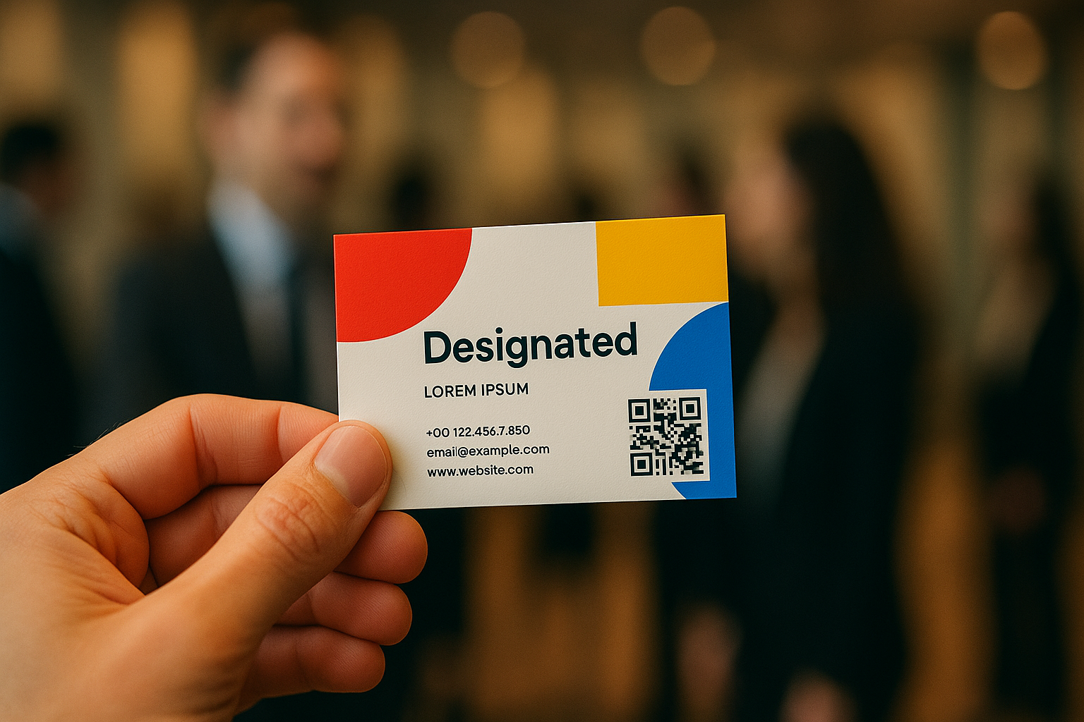
Modern Features: QR Codes and Digital Touchpoints
In 2025, the bridge between physical business cards and digital presence has become essential, with QR codes emerging as the primary connector between these two worlds. Traditional business cards now routinely incorporate this technology to extend their functionality beyond the limitations of paper.
1. Why QR codes are gaining popularity
QR codes have experienced a significant revival in recent years, becoming a standard feature in modern business card design. These digital doorways allow recipients to instantly access your digital footprint, whether your portfolio, LinkedIn profile, or product catalog. Unlike physical cards that limit information by size, QR codes effectively “eliminate the limits of paper real estate”, offering unlimited digital expansion opportunities.
Additionally, QR codes provide valuable analytics that traditional cards cannot. According to QRCodeChimp, business owners can track scans, locations, and user engagement, gathering insights about networking effectiveness that were impossible with conventional cards.
2. Where to place a QR code for balance
Strategic placement ensures your QR code enhances rather than detracts from your card design:
- Position the code in a visible, uncluttered area
- Ensure adequate white space around the code to prevent scanning interference
- Consider placing it on the back of the card to separate it from other information
- Make it at least 3cm x 3cm for easy scanning
3. Avoiding clutter: QR code etiquette
Despite their capacity to display extensive information, QR codes should follow the “less is more” principle. Avoid overwhelming viewers with excessive information; your website or LinkedIn profile can provide additional details. Always include a clear call-to-action near your QR code, such as “Scan for contact info” or “Scan to view portfolio”.
4. Tech-forward design = modern impression
Incorporating QR technology signals that your brand is technologically adept. This modern approach creates an immediate impression of innovation. For maximum impact, ensure your QR code has sufficient contrast against its background and consider customizing its appearance with colors and designs that align with your brand identity.
Remember to test your QR code thoroughly before printing. A non-functioning code defeats its purpose and can leave a negative impression.
Free Tools and Smart Features for Better Design
Creating a professional business card design for free doesn’t require expensive design software or expert skills. Today’s online platforms offer sophisticated features while incorporating psychological design principles effortlessly.
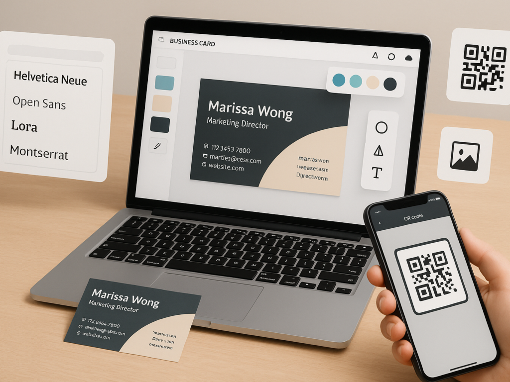
1. Top free business card design tools (Canva, Adobe Express)
Canva stands out as a powerhouse for business card creation, offering thousands of customizable templates that incorporate effective psychological design elements. With its drag-and-drop editor, you can adjust colors to match your brand identity while maintaining proper visual hierarchy. Similarly, Adobe Express provides a streamlined experience with pre-made templates that maximize psychological impact through strategic color placement and layout balance.
Both platforms enable you to:
- Upload your logos, photos, and graphics
- Apply professional filters and effects
- Choose from hundreds of psychologically effective fonts
- Add QR codes linking to your website or social profiles
Notably, these tools save your designs digitally, allowing for easy updates when your contact information changes, and no need to start from scratch.
2. How to apply psychology using templates
Even free templates incorporate sophisticated psychological principles. Specifically, look for designs with adequate whitespace, as this element is generally associated with sophistication. When selecting templates, consider how they align with your industry’s expectations while adding unique elements that make your card memorable.
A practical approach is to type descriptive words about your business using different fonts within the template. This practice helps determine if the font genuinely conveys your intended brand personality. Alternatively, identify whether you can discern the opposite mood of a font; if not, it might lack clarity.
3. Business card design with QR code: Pros and cons
Including QR codes offers clear advantages; they bridge physical cards with unlimited digital content, allow user engagement tracking, and simplify contact saving. Furthermore, they showcase technological savviness, creating a modern impression.
Nevertheless, challenges exist. If poorly placed, QR codes disrupt visual balance, are inaccessible to those without smartphones, and depend on internet connectivity. Most importantly, cybersecurity concerns may cause some recipients to hesitate to scan unfamiliar codes.
4. Free vs. custom design: What to consider
When deciding between free templates and custom designs, evaluate your branding needs thoughtfully. Free tools like Canva, VistaCreate, or Adobe Express offer excellent starting points for testing colors, typography, and concepts. Conversely, working with professional designers, though more expensive, provides unique designs tailored to your specific psychological objectives.
For maximum impact without breaking your budget, consider customizing templates extensively rather than starting with blank designs. This approach balances originality with the psychological principles built into professionally designed templates.
Conclusion: Creating Lasting First Impressions
Your business card represents much more than contact information; it is a tangible extension of your brand’s personality and values. The psychology behind effective business card design influences how potential clients perceive your professionalism, trustworthiness, and attention to detail. Colors speak volumes. Blue establishes trust, red conveys energy, black exudes sophistication, and green suggests growth. Choose your palette deliberately to align with industry expectations and brand personality.
Shape and layout choices, whether a traditional rectangle or an innovative die-cut, communicate your business approach without an explicit statement. Strategic use of white space enhances readability and demonstrates design sophistication. Modern features like QR codes, when used well, bridge the physical card with digital content while showing technological competence. Thoughtful restraint often communicates more effectively than clutter.
Excellent design doesn’t require professional expertise. Platforms like Canva or Adobe Express let you experiment with colors and formats to gauge audience reactions. Regardless of design choices, your card creates a lasting psychological impression. This small rectangle is a powerful opportunity to stand out professionally. When recipients later encounter your brand, the thoughtful design will reinforce your credibility and memorability.
FAQs on Business card design
Q1. What is the best size for a business card?
The standard business card size is 3.5 x 2 inches. This size fits easily into wallets and cardholders, making it practical and professional. It ensures compatibility with most printing templates and maintains a traditional, recognizable appearance.
Q2. How do I add a QR code to my business card design?
Use free tools like Canva or Adobe Express to generate and position your QR code. Place it in a clean, visible spot, typically the back of the card. Ensure it’s large enough to scan easily without cluttering your design.
Q3. Are free business card design tools worth it?
Free design tools offer great templates, drag-and-drop interfaces, and customization options. They’re ideal for small businesses or freelancers. While premium tools offer advanced features, free platforms like Canva provide high-quality results without needing professional design skills.