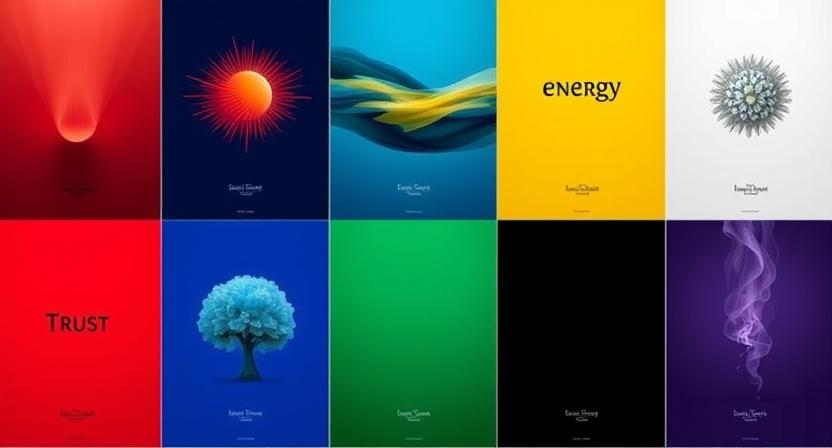
You’re walking down the street, minding your own business, when suddenly a poster catches your eye. Bright red, bold letters, practically shouting for your attention. You stop. Why? Because colors aren’t just colors, they mess with your brain. They make you feel things, whether you realize it or not.
In the world of poster design services, mastering color psychology is everything. It is science, not some hip jargon. Studies show that after ninety seconds consumers develop an opinion about a good, brand, or design. Unbelievably, 90% of that choice is based just on hue.
Therefore, choosing the correct colors may either help or ruin your business whether you are designing graphic design posters or thinking about hiring poster designers. The correct color may arouse feelings, foster confidence, and perhaps increase sales. Ignore color psychology; you run the danger of either completely communicating the wrong message or merging into the backdrop.
How Poster Design Services Use Colors to Manipulate Your Brain
Every color tells a story. Makes you feel something. And when it comes to movie poster design minimalist or eye-catching ad posters, color does half the talking.
1. Red: The Drama King
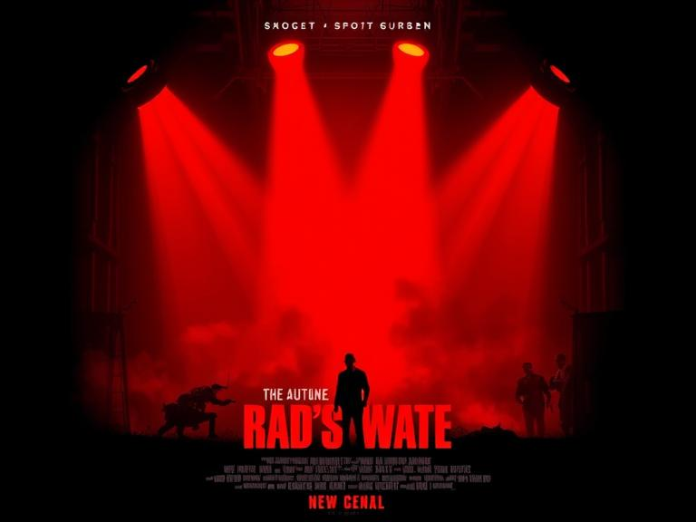
Red is bold. Loud. Impossible to ignore. It demands attention like a fire alarm in a quiet room. That’s why it’s often the go-to color for creating urgency, passion, and power in poster design services. Why Does Red Work So Well?
Red has the longest wavelength in the visible spectrum, making it the first color the human eye notices. It’s why STOP signs, emergency lights, and sale tags are almost always red, they force you to pay attention.
(i) Emotional Impact:
- Excitement & Energy: Red triggers strong emotions, from love to anger.
- Appetite Booster: Studies show red stimulates hunger, which is why fast food giants like McDonald’s, KFC, and Pizza Hut use red in their branding.
- Urgency & Action: Ever noticed how “LIMITED TIME OFFER” banners are usually red? It’s no accident, red makes people act fast.
(ii) In Poster Design:
- Horror & Thriller Posters: Red builds tension and raises heart rates. Think of The Shining’s chilling red typeface or the iconic red and white poster for Jaws.
- Romance & Drama Films: Red evokes passion and intimacy. Posters for movies like Moulin Rouge or American Beauty lean heavily on red to symbolize love, desire, and intensity.
Use red strategically. Too much can feel overwhelming, while small touches, like a red headline or focal point, can create powerful visual impact.
2. Blue: The Trustworthy Nerd
Blue is calm. Collected. The color that whispers, “Relax, we’ve got this.”
(i) Why Blue Wins Hearts:
- Instantly creates feelings of trust and reliability.
- Encourages calm thinking and focus.
- Known to reduce stress levels, making viewers feel secure.
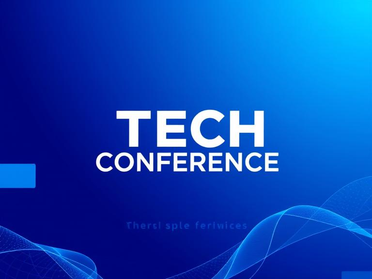
(ii) Where Blue Dominates:
- Banks and tech giants love blue, think Facebook, PayPal, and IBM.
- Great for corporate posters, seminars, or tech product launches.
- Often seen in sci-fi movie posters to signal innovation and the unknown.
(iii) Design Tip:
- Want a sleek, modern look? Pair blue with white or silver.
- For extra pop, add a splash of orange, it’s bold but balanced.
3. Yellow: The Attention Seeker
Ever walked past a bright yellow sign and felt like it was practically yelling at you to stop and look? That’s no accident, yellow demands attention like no other color.
- Why? Yellow triggers excitement and grabs attention fast.
- It’s the color of sunshine, joy, and energy, perfect for upbeat messages.
- Studies show yellow can also boost memory recall, making your poster more memorable.
But there’s a catch. Too much yellow feels overwhelming, even stressful.
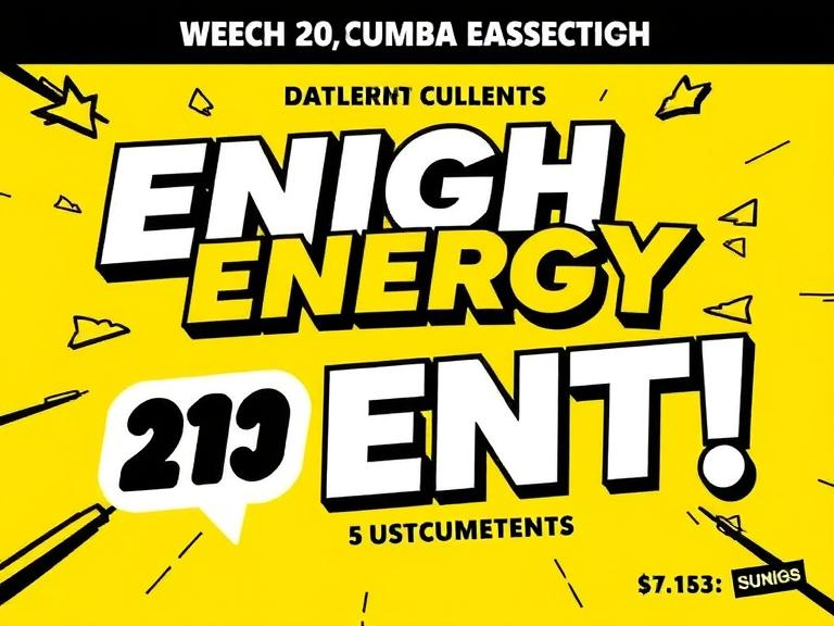
Best Uses:
- Headlines that need to pop.
- Highlighting key details.
- Pairing with darker shades like navy or gray for balance.
A splash of yellow? Perfect. A wall of yellow? Prepare for headaches.
4. Green: The Zen Master
Green is cool. new. Simple on the eyes. Your creations will have tranquility and stability from the hue of balance and harmony. No surprise eco-brands, health firms, and even financial institutions focus on green to promote trust and serenity. Why Does Green Work So Well?
Green is squarely in the center of the color spectrum, making it the most soothing hue for the human eye. It’s the shade we connect with nature, growth, and rejuvenation. This makes it excellent for companies that want to feel organic, ethical, or health-conscious.
(i) Emotional Impact:
- Relaxation & Calm: Green lowers the pulse and relieves tension. It’s why spas, yoga studios, and wellness retreats commonly contain colors of green.
- Trust & Stability: Financial organizations like TD Bank and Fidelity utilize green to indicate security and growth.
- Freshness & Health: Supermarkets commonly use green in their branding to showcase organic products and fresh food departments.
(ii) In Poster Design:
- Eco-Friendly & Sustainability Posters: Shades of green signal environmental awareness and nature-focused messaging. Think of Earth Day campaign posters or climate change awareness designs.
- Health & Wellness Promotions: Smoothie bars, gyms, and wellness events often use green to suggest vitality and balance.
- Calm Yet Impactful Designs: Green backgrounds paired with white text create a fresh, clean aesthetic that’s easy to read and inviting.
When using green, balance is key. Too much can feel dull or stagnant, but the right touch adds freshness and calm to your design.
5. Black: The Elegance Overlord
Black is bold. Strong. The ultimate power move. It’s the color of mystery, sophistication, and luxury. Think of a black tuxedo or a sleek sports car, black screams prestige. In poster design services, black adds drama and authority.
(i) Why Does Black Work So Well?
- Contrast Master: Black creates powerful contrast, making bright colors pop. Ever seen a luxury perfume ad? Black background, glowing product. It works.
- Timeless Appeal: Black never goes out of style. It’s versatile enough to feel modern or classic depending on how you use it.
(ii) Emotional Impact:
- Power & Strength: Black radiates control, making it ideal for posters promoting elite events or luxury brands.
- Mystery & Intrigue: Black is perfect for suspense films, fashion events, or edgy brand campaigns.
(iii) In Poster Design:
- Luxury Brands: Think Chanel or Prada. Their use of black reinforces status and elegance.
- Action & Thriller Posters: Black paired with fiery red or metallic accents screams intensity.
Use black carefully. Too much can feel cold or intimidating, while just enough creates bold, unforgettable designs.
6. White: The Minimalist’s Dream
White is calm. Pure. Effortlessly chic. It’s the color of simplicity and clarity, making it a must-have for modern poster design services.
(i) Why Does White Work So Well?
- Breathing Room: White space (or negative space) gives designs balance. It helps other elements shine.
- Clean & Fresh: White promotes cleanliness, which is why it’s popular in healthcare, wellness, and tech posters.
(ii) Emotional Impact:
- Simplicity & Focus: White directs attention straight to your message.
- Peace & Purity: Perfect for calming visuals or minimalist brands.
(iii) In Poster Design:
- Tech Launches & Startups: White paired with sleek typography feels cutting-edge.
- Art Exhibits & Fashion Shows: White backgrounds let bold designs steal the show.
White thrives when paired with vibrant colors or bold text. It’s the silent partner that amplifies everything else.
7. Orange: The Friendly Hustler
Orange is warm. Fun. The life of the party. It’s full of energy, making it perfect for poster design services targeting youthful, upbeat audiences.
(i) Why Does Orange Work So Well?
- Attention Magnet: Studies show orange boosts enthusiasm and energy.
- Positive Vibes: Orange feels welcoming, making people feel comfortable.
(ii) Emotional Impact:
- Confidence & Creativity: Orange encourages boldness and innovation.
- Friendliness & Warmth: Great for community events, festivals, or sports.
(iii) In Poster Design:
- Fitness & Sports Brands: Orange fuels excitement and movement.
- Food Promotions: Orange triggers hunger, making it great for casual dining posters.
Use orange strategically. It’s powerful, but too much can feel overwhelming. A pop of orange grabs attention without overdoing it.
8. Purple: The Royal Vibe
Purple is rare. Mysterious. It’s the color of royalty, creativity, and magic. In poster design services, purple evokes a sense of wonder and imagination.
(i) Why Does Purple Work So Well?
- Unique & Memorable: Purple is less common, making it stand out in crowded spaces.
- Fantasy & Creativity: It’s often tied to mystical themes, perfect for sparking curiosity.
(ii) Emotional Impact:
- Luxury & Power: Deep purples feel elegant and regal.
- Mystery & Magic: Lighter purples feel dreamy and whimsical.
(iii) In Poster Design:
- Fantasy Films & Sci-Fi Posters: Purple hints at the unknown and surreal.
- Beauty & Wellness Brands: Purple adds a calming, luxurious touch.
Purple can be tricky. Darker shades bring elegance, while lighter tones add softness. Finding the right balance is key to unlocking purple’s magic.
The Secret Science Behind Successful Graphic Design Posters
Colors don’t just sit there looking pretty, they have a plan. Successful graphic design posters use color combinations that create balance, contrast, and impact. Here’s how top designers make it happen:
1. Complementary Colors: Opposites Attract
- These are colors that sit directly across from each other on the color wheel, like blue and orange or red and green.
- High contrast grabs attention. It’s bold, dynamic, and eye-catching.
- Action-packed movie posters, sports events, or sale advertisements where you want people to notice fast.
The movie poster for Mad Max: Fury Road nails this. Fiery oranges clash with cool blues, creating intense visual drama.
2. Analogous Colors: Harmony in Motion
- These are colors that sit next to each other on the color wheel, like red, orange, and yellow or blue, teal, and green.
- They create a smooth, unified look that feels natural and comforting.
- Posters promoting calmness, nature, or family-friendly content.
Wellness brands often use soft greens, blues, and yellows to create a peaceful vibe.
3. Triadic Colors: Balance & Energy
- Three colors evenly spaced on the color wheel, like purple, green, and orange or red, blue, and yellow.
- Triadic schemes are vibrant without being overwhelming. They offer balance with plenty of contrast.
- Posters promoting creative events, festivals, or artsy content.
The movie poster for The Grand Budapest Hotel uses pastel pinks, blues, and yellows for a quirky yet balanced look.
Why Does This Matter?
A study by the University of Winnipeg found that ads using effective color combinations increase memory recall by 42%. In short, the right color scheme doesn’t just look good, it sticks in your brain.
Poster designers know that color choice isn’t random. Each shade tells a story, sparks emotion, and makes you remember. So next time a poster grabs your eye, chances are, the color science is hard at work.
What Works in Movie Poster Design Minimalist
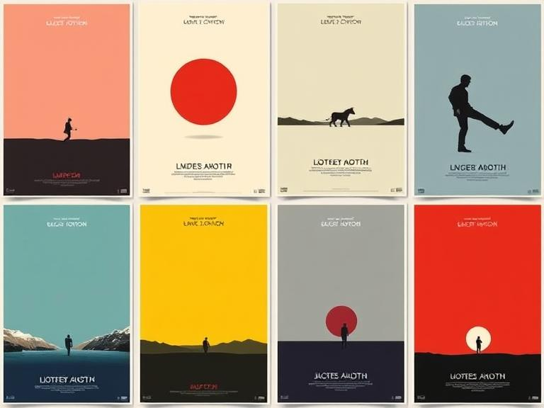
Minimalist movie posters strip away the noise. No clutter. No chaos. Just powerful visuals driven by smart color choices. Here’s how iconic films used color to master movie poster design minimalist magic:
1. The Dark Knight: Black, Blue, and Orange
The blend of black and blue sets a dark, mysterious tone, perfect for Gotham’s eerie atmosphere. The bright orange glow? That’s your tension point, symbolizing chaos, fire, and the Joker’s unpredictable menace.
The poster’s simplicity (just Batman standing amid smoke and flames) lets the colors do all the talking. No extra elements needed.
2. La La Land: Purple, Blue, and Yellow
Purple evokes creativity, while blue adds calmness. The pop of yellow brings warmth, like a streetlight glowing over two dreamers dancing.
With a simple skyline backdrop and two figures silhouetted in soft colors, the poster feels romantic yet uncluttered, classic movie poster design minimalist style.
3. Jaws: Red, Black, and White
Red screams danger and blood. Black adds fear. The stark white highlights the lurking shark, creating a chilling contrast.
The poster doesn’t need extra detail, the shark’s shadow, the swimmer, and bold red text are enough to spark fear.
Why Minimalism Wins in Poster Design
- Focused color choices make key elements stand out.
- Simple designs create memorable visuals.
- Research shows minimalist posters boost viewer retention rates by up to 46%, your brain locks in those bold color contrasts.
In short, movie poster design minimalist isn’t just about fewer elements, it’s about choosing the right colors to make your message unforgettable.
Why Hiring Poster Design Services Is a Smart Move
Look, anyone can throw some colors on a poster. But making people stop? Look? Feel? That’s an art. Professional poster designers know how to mix colors, use contrast, and balance elements so your message hits hard.
A 2022 study by Adobe found that 38% of people won’t even engage with visual content if the design is ugly. And bad color choices? That’s a one-way ticket to “meh.”
Conclusion: The Power of Poster Design Services
Color is more than simply visual appeal, it’s a strong instrument that generates emotion, draws attention, and leaves a lasting impact. The appropriate color selections may convert ordinary designs into outstanding pictures. Whether you’re building graphic design posters or seeking poster design services for your next project, understanding color psychology is vital. From strong reds to tranquil blues, each tint tells a story. Professional poster design services know how to blend colors for maximum impact, ensuring your poster stands out and interacts with readers. Choose colors judiciously, your poster’s success depends on them.