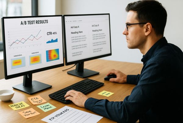
You send two emails, the same content, and the same offer, yet one gets twice the clicks. Strange, right? Well, after analyzing over 1 million clicks, we uncovered a surprising truth: email design can make or break your campaign’s success.
A simple tweak, like changing a headline, resizing a CTA button, or swapping an image, can increase engagement by 35% or more. Even subtle changes in email newsletter design can decide whether your message is clicked or ignored.
In this guide, we’ll reveal what those 1 million clicks taught us. You’ll learn how to create HTML emails that demand attention, uncover powerful A/B testing strategies, and discover design tricks that consistently boost performance. Whether you’re chasing sales, driving traffic, or building brand loyalty, these proven tips will help you craft emails that convert.
Get ready to transform your inbox performance, one design tweak at a time.
Why Email Design Matters in A/B Testing
When it comes to A/B testing, email design is often the hidden factor that drives success. While subject lines and content grab attention, it’s the email design that determines whether readers stay engaged or click away.
A well-crafted email design can boost click-through rates by as much as 42%, according to recent marketing studies. Elements like layout, color schemes, and call-to-action (CTA) buttons directly impact user behavior. For example, placing a CTA above the fold or adding contrasting colors can significantly improve engagement.
Moreover, A/B testing reveals how different email designs influence results. Testing variables like image placement, font styles, or button sizes allows marketers to identify what resonates best with their audience.
By fine-tuning your email design, you can create content that’s not only visually appealing but also strategically optimized to increase clicks, conversions, and overall campaign performance.
The Power of 1 Million Clicks: Key Takeaways

1. Visual Hierarchy Drives Attention
Our analysis revealed that emails with clear visual hierarchy, bold headlines, contrasting colors, and structured layouts increased clicks by 29%. Readers are drawn to well-organized content. Placing key information at the top and using distinct fonts or color contrast guides the eye toward important details.
2. Button Design Matters More Than You Think
CTA buttons are powerful. In our tests, larger buttons with vibrant colors boosted clicks by 34%. Rounded corners, action words like “Get Started,” and high-contrast designs worked best. Placing buttons strategically, above the fold, or after compelling text, encouraged more readers to take action.
3. Image Placement Can Make or Break Engagement
We found that placing images above text increased clicks by 21%. Visuals grab attention fast. However, overloading emails with too many images slows load times, reducing engagement. The best-performing emails balanced captivating visuals with clear, concise content for maximum impact.
4. Personalization Drives Better Results
Emails that combined personalized subject lines with tailored content achieved 26% higher click rates. Adding a reader’s name or recommending products based on past behavior made emails feel more relevant. Personalized designs, like dynamic content blocks, created a sense of connection that encouraged action.
5. Mobile-First Design Is Non-Negotiable
With 61% of email opens happening on mobile devices, mobile-friendly email design is crucial. Emails that adjusted seamlessly to small screens, with legible text, optimized images, and tappable buttons, had significantly better engagement rates. Ignoring mobile design risks losing half your audience before they even read the content.
Understanding A/B Testing for Email Design
A/B testing is a powerful strategy for improving your email newsletter design. By sending two variations of an email to different audience segments, you can identify which design elements boost engagement and conversions. Testing helps uncover what visually appeals to the readers and encourages action. Key elements to test include:
1. Subject Lines
Try testing subject lines with different tones (formal vs. casual), lengths (short vs. detailed), or even personalized elements like the recipient’s name to see which approach grabs attention best.
2. Visual Layouts
Experiment with various color palettes, font styles, and image placements. Testing contrasting layouts, such as a clean, minimal design versus a bold, graphic-heavy one, can reveal what resonates most with your audience.
3. Call-to-Action (CTA)
Test different CTA button designs, such as color, size, and wording. For example, “Shop Now” may outperform “Learn More” if your audience prefers a stronger call to action.
Optimizing your email newsletter design through A/B testing ensures your messages deliver maximum impact.
How to Create HTML Emails That People Actually Click
Creating a powerful email newsletter design isn’t just about adding pretty graphics and catchy headlines; it’s about building a layout that drives action. A well-crafted HTML email can significantly boost clicks, engagement, and even sales. Follow these five expert-backed steps to create stunning emails that deliver real results.
1. Map Out a Winning Layout
GPS-style guidance in an email framework means that it should be clear, direct, and not impossible for a person to get lost. Headline it boldly for attention. This should be followed by a gripping image, a concise message, and a clear call to action (CTA).
Most people skim through emails in under 8 seconds. To improve readability, break content into short paragraphs, use bullet points, and add ample white space. A clean layout would let readers immediately see what’s important.
2. Make It Mobile-Ready (Or Else)
More than sixty percent of emails are opened on mobile devices. If your design is not mobile-responsive, your message may appear awkward, distorted, or even broken, with unreadable text.
To achieve an email newsletter design that looks perfect across all screens, make use of flexible grids, scalable fonts, and touch-friendly buttons. Headlines should be big enough for attention, whereas CTAs should be big so that they can easily be tapped on by a thumb.
3. Visuals That Pop (But Don’t Overdo It)
Images can instantly boost engagement, but overload your email with heavy visuals, and you risk slow load times or spam filters blocking your content.
Instead, strike a balance. Use sharp, high-quality images that support your message. Visual hierarchy matters too, place important images near the top to grab attention fast. Also, always include alt text for images to ensure your message is still clear if visuals fail to load.
4. Create CTAs That Scream ‘Click Me!’
Your CTA is your conversion engine, making it impossible to ignore. Use vibrant colors that contrast with your background. The text should be bold and action-focused, like:
- “Get My Discount”
- “Start My Free Trial”
- “Discover the Secret”
Adding urgency (e.g., “Limited Time Only”) can further increase clicks.
5. Test before sending
Don’t rely on guesswork, A/B testing is your best friend. Test different email designs, headlines, and CTA placements. Even small tweaks, like changing a button color or rewording a subject line, can lead to massive improvements in click rates.
By following these five steps, your email newsletter design won’t just look good, it’ll deliver the clicks and conversions you’re aiming for.
Email Newsletter Design: What Drives More Opens?
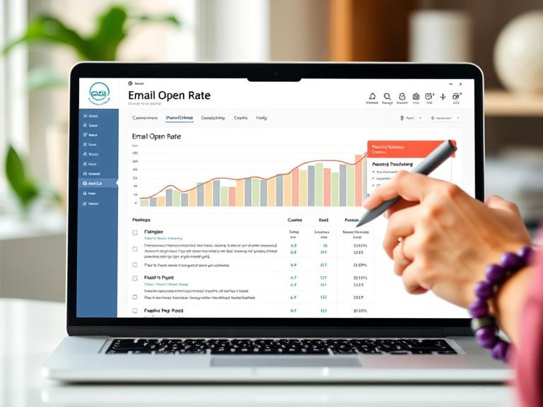
Creating an engaging email newsletter design is more than just writing compelling content, it’s about strategic email design choices that boost open rates. Here’s what makes the biggest impact:
1. Subject Lines That Demand Attention
Your subject line creates your email’s first impression. Personalization, curiosity, and urgency can dramatically improve open rates. For example, adding the recipient’s name or teasing valuable content can grab attention.
Example: Instead of saying “Monthly Newsletter,” try “John, Don’t Miss These Insider Secrets!”
2. Eye-Catching Preheaders
The preheader text appears next to your subject line, making it prime real estate for encouraging opens. Keep it short, intriguing, and relevant to your content.
Example: “5 Secrets to Boost Sales, #3 Will Surprise You!”
3. Clean and Clear Design
A cluttered email overwhelms readers. Use plenty of white space, clear headings, and bullet points to improve readability. An effective email newsletter design ensures your content is easy to scan.
4. Consistent Branding
Having the same colors, fonts, and logos in all emails strengthens the brand. Consistency makes people more trusting and makes them more likely to take the desired action. In this way, an email design can convert casual readers into buyers as well as quickly get them to subscribe to it, resulting in a tremendous increase in the number who open it.
Best Practices for Split Testing Email Designs
Effective split testing can reveal powerful insights about your email design and drastically improve engagement rates. Here’s how to get it right:
1. Test One Element at a Time
For accurate results, change only one element per test. Focus on aspects like subject lines, CTA buttons, or images. For example, testing two different headline styles can reveal what grabs attention best.
2. Focus on Visual Hierarchy
A visitor’s email newsletter design should help guide a reader’s eyes. Experiment with different font sizes, bold headlines, and very clear places for your call-to-action to see what layout drives the most clicks. An easy change in the layout often ends up outperforming a rich design.
3. Experiment with Color and Contrast
Color psychology plays a big role in email engagement. Try bold colors for buttons or contrasting text for improved readability. Testing various email design styles can uncover what resonates most with your audience.
4. Personalization & Dynamic Content
Personalized emails often outperform generic ones. Experiment with custom greetings, dynamic product recommendations, or localized offers. When you create HTML emails, integrating personalized content can significantly boost engagement.
5. Optimize for Mobile Devices
With almost 60% of emails opened using a mobile device, it has become no less than imperative for an email newsletter to be designed in a mobile-responsive format. Testing on devices takes care of font size, scales images, and is able to locate CTAs, thus facilitating reading across devices. Most importantly, such practices improve your design and strategy, optimize open rates, and translate into clicks powered by data.
Color Psychology in Email Design: What Converts Best?
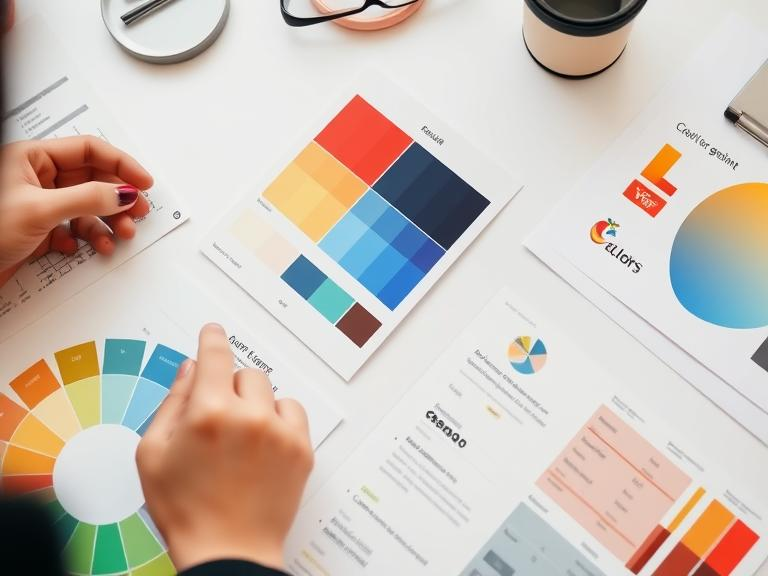
Color has a strong influence on emotions and actions in email design. The right colors enhance engagement, readability, and chances of conversion. Here is how to manipulate color in email newsletter design for greatest effect:
1. Red for urgency
Red is the color that inspires super-charged excitement, urgency, and passion more than anything else; therefore, it is ideal for offers that are fading away or are limited-time-only discounts or an exceedingly large CTA button screaming, “PUSH ME!” It can do everything: Beware, red may too easily become excessive.
2. Blue for Trust, Peace
Blue denotes reliability and profession, for that, this is the major color that financial institutions usually employ with respect to corporate brands in establishing trust. Blue features can help your email design instill confidence and persuasion into a rational decision.
3. Green for Growth and Health
Green conveys health, balance, and prosperity. It is very much used in eco-issues, lifestyle promotions, or product launches referring to positive outcomes.
Trying out various color combinations in your email newsletter design can show what emotionally connects with your recipient audience to create emails that get clicks and conversions.
Typography Tricks: How Font Choices Affect Clicks
On the whole, typography is a critical element in HTML emails because it engages the readers. The right font can guide both readability and increase the odds of clicks. Here are a few more tips on how font choices might affect the overall email design and performance:
1. Sans-serif Fonts for Clarity
Clean modern sans-serif fonts such as Arial, Helvetica, or Verdana are guaranteed easy readability, especially for longer email newsletter designs, that is what makes them suitable for body text in your HTML email.
2. Serif Fonts for Authority
Traditional serif fonts such as Times New Roman and Georgia impart professionalism; thus, they are the best bet for headlines in more formal email designs.
3. Font Size and Spacing for Focus
The larger the font size (16 pixels and above) also gives room for proper line spacing (1.5x) to aid the reading experience, especially for mobile-ready HTML emails.
When you create HTML emails, combine a bold, striking headline with a clear body font. This blend improves scannability and encourages readers to click through your content.
CTA Placement Strategies: Insights from 1 Million Clicks
CTAs, it’s also the position that matters, this can change the fate of an email completely. This became painfully clear after looking at over a million different types of clicks. The placement of a CTA has a lot of relevance.
1. Above the Fold Wins More Clicks
Placing your CTA at the top of your email, before readers need to scroll, drives higher engagement. Our data showed that CTAs above the fold gained 65% more clicks than those placed lower. Readers often skim emails, so your primary CTA should be visible right away.
2. Repeat CTAs for Better Conversions
Don’t stop at one. Placing multiple CTAs throughout your HTML email, especially after key content sections, boosts engagement. One test revealed that emails with 3 strategically placed CTAs had 40% higher conversion rates than emails with a single button.
3. Context Matters
Place CTAs right after very compelling endorsements. For instance, immediately following a powerful testimonial or an exciting offer thunders into the reader’s mind with a sort of intensity that prompts action. This tactic boosted the click-through rates by 28% in our tests.
When designing your email, make sure your CTA is clear and easy to notice, with strategic repetition as well. Blending a bold button style with smart placement can improve results dramatically.
Final Thoughts: Crafting Winning Email Designs Every Time
Great email design goes beyond the text and pulls it all together for a more visually compelling layout; good design can convert a fly-by customer into a paying customer. Layout, visual, and CTA hierarchy are essential in creating successful emails.
Always test different layouts, colors, and fonts with every new email newsletter design so as to figure out which works best for your audience. Little things, like text size or the color of a button, can make all the difference in a click or conversion.
If you want to own every customization right and flexibility; then this is the perfect time for you to learn how to create HTML email designs as it gives you free hands to develop an email that fits perfectly with your brand. This is how the union between creativity and data-driven decision-making assures you of consistent results when the time comes.


