Introduction
Picture this. You’re flipping through a catalog. The products are there, but something feels… off. The images are blurry, the layout is messy, and the whole thing looks like it was designed in 2005. You shut it immediately. Now imagine a catalog that feels premium. The images are crisp, the colors pop and the graphics guide your eyes exactly where they should go. It feels different, right? That’s the power of catalog design done right.
But hold up. It’s not just about slapping in a few pictures and calling it a day. Oh no, my friend. There’s a science to it. A method. And if you don’t get it right, well, you might as well throw your catalog in the trash.
So, let’s talk. You and me. Right here, right now. We’re diving into how images and graphics can make or break your catalog design. Buckle up.
Why Visuals Matter in Catalog Design
People remember 80% of what they see but only 20% of what they read. Yep, your catalog could have the best product descriptions in the world, but if your visuals are bad? Game over.
A study by Adobe found that 66% of consumers prefer visually appealing content. So, if your catalog looks like it was made with Microsoft Word Clip Art… yikes.
Good Design = More Sales
Think of the catalogs you love. IKEA? Apple? High-end fashion brands? They invest heavily in catalog designers because they know one thing: Better visuals mean better sales.
In fact, research shows that high-quality product images can increase sales by up to 30%. That’s right. Just fixing your images and graphics can boost revenue.
IKEA’s Catalog Design Success
IKEA, the king of catalog design. At its peak, IKEA’s print catalog was the most widely disseminated magazine in the world, exceeding even the Bible. Why? Because they perfected the art of visual storytelling.
What They Did Right
1. High-Quality, Realistic Images
Instead of flat product shots, IKEA utilized 3D-rendered images that appeared amazingly authentic. In fact, 75% of their catalog images were CGI, allowing perfect lighting, angles, and consistency.
2. Lifestyle Context
A sofa wasn’t just a sofa. Buyers were able to visualize it in their own homes because it was positioned in a comfortable and tastefully decorated room.
3. Clever Graphics Use
They saved space while conveying important information by including icons for measurements, material details, and assembly difficulty.
Psychology-Driven Colors: The collection seemed approachable and ambitious thanks to warm, welcoming hues.
The Results
- 210 million copies distributed in 32 languages
- Website traffic surged as the catalog encouraged online purchases
- Global brand recognition as IKEA’s catalog became a household staple
Lesson for Your Catalog Design
Your catalog isn’t just a product list, it’s an experience. Use high-quality images, context, graphics, and psychology to guide buyers. If a global giant like IKEA focuses this much on catalog design, shouldn’t you?
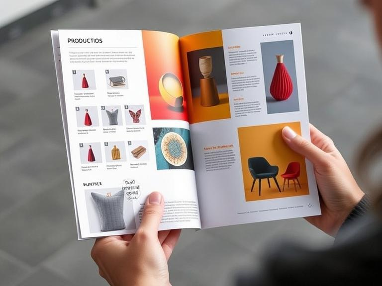
How to Choose the Right Images for Your Catalog
Not all images are created equal. You can’t just snap a quick pic on your phone and expect it to work. This isn’t Instagram. This is business.
1. High-Resolution or Nothing
Blurry images? Instant deal-breaker. If your catalog images aren’t crisp, your products won’t shine.
Why 300 DPI? Because anything lower turns sharp details into a smudged mess. Screens might forgive low-res, but print? Brutal.
Quick Fixes:
- Use 300 DPI for print (no exceptions).
- Ensure images are at least 2000×2000 pixels.
- Never stretch small images, quality dies.
- Get pro shots or request high-res from suppliers.
Your catalog’s visuals are your brand’s first impression. Make them sharp or don’t bother.
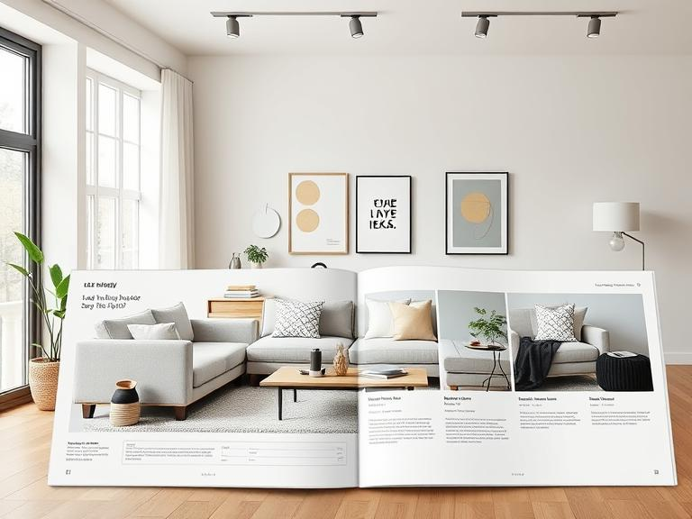
2. Show Your Product in Action
A plain product on a white background? Feels cold. Feels lifeless. But place it in a real-world setting, and suddenly, it speaks.
- A couch in a stylish living room? Now it looks cozy, inviting.
- A watch on a well-dressed wrist? Feels premium, aspirational.
- A laptop on a busy desk? Shows productivity, importance.
People don’t just buy things. They buy emotions, experiences, and lifestyles. Give them a scene they can picture themselves in. Because when they see it, they want it.
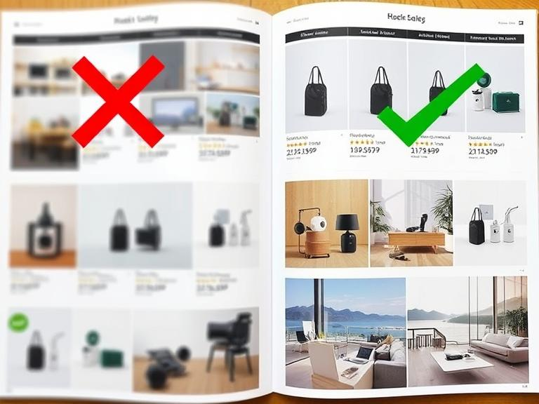
3. Keep It Consistent
Imagine flipping through a catalog, one page has a sleek, professional shot, and the next? Looks like a phone pic taken in bad lighting. Feels off, right?
Consistency matters. Stick to a unified color theme, lighting style, and editing technique across all images. If your catalog has a modern, minimal vibe, don’t suddenly throw in overly saturated, dramatic shots. It’s like wearing sneakers with a tux, confusing.
A well-coordinated look makes your catalog feel polished, trustworthy, and high-end. And trust me, people notice when things feel right.
4. Variety, But Not Too Much
Give people options, but don’t overwhelm them. A few key shots do the trick:
- Main image: Shows the full product clearly.
- Close-up: Highlights details (texture, buttons, stitching, etc.).
- Lifestyle shot: Places the product in a real-world setting.
Too many angles? Buyers get distracted. Too few? They don’t get the full picture. Balance is everything.
Think of it like food photography. One great shot of a burger with melty cheese is mouthwatering. Ten shots from every possible angle? Overkill. Keep it simple, clear, and effective.
Graphics: The Secret Weapon of Effective Catalog Design
Photos are crucial, but graphics tie everything together. They guide the reader’s eyes, create visual hierarchy, and make your catalog more digestible.
1. White Space is Your Best Friend
Too much text, too many images, it’s a headache. White space fixes that. It guides the reader’s eye, making your Company catalog design feel clean, modern, and easy to scan.
- Improves readability: No one likes walls of text.
- Makes products pop: Items stand out instead of blending into chaos.
- Creates a premium feel: Luxury brands use white space for a reason.
Think of it like a well-organized closet. Everything has its place, and nothing feels crammed. Your catalog should feel the same, structured, stylish, and stress-free.
2. Icons Make Everything Easier
Text-heavy catalogs? Exhausting. Icons? Instant clarity. A small leaf icon says organic without a word. A truck symbol hints at fast shipping. Simple, visual, and universally understood.
- Saves space: Fewer words, more impact.
- Boosts readability: Quick info, no effort.
- Adds style: Clean, modern design touch.
Use icons smartly in your Company catalog design, just don’t overdo it. Too many, and it starts looking like a game of Pictionary. Keep it sleek, keep it useful.
3. Color Psychology is Real
Colors do more than just look pretty, they control emotions and influence buying decisions. Ever wonder why clearance sales scream in red or why tech brands love blue? It’s all psychology.
- Red creates urgency (Think: Limited-time offers).
- Blue which builds trust (Banks, insurance, tech giants).
- Green represents nature and health (Perfect for sustainable brands).
- Yellow feels warm and inviting (Great for fun, friendly branding).
For a powerful Product catalog design, choose colors that match your brand’s message, not just what looks nice.
4. Fonts Matter More Than You Think
Fonts set the tone. Pick the wrong ones, and your catalog looks messy.
- Bold font for headlines, Grabs attention instantly.
- Clean, simple font for body text, Easy to read. No headaches.
- Handwritten or script font for accents, Adds personality (but use sparingly).
Using more than three fonts? Big mistake. It makes your Company catalog design look unprofessional. Keep it clean, keep it readable.
Sans-serif fonts (like Helvetica) look modern and clean, while serif fonts (like Times New Roman) feel traditional and classy. Pick one that matches your brand.
The Role of Catalog Designers: Do You Need One?
You could design your catalog yourself. But should you?
Catalog designers do more than just arrange pictures. They create layouts that sell, ensure consistency, and make sure your catalog looks professional, not like a rushed school project.
- They prevent design chaos, no clashing fonts or awkward layouts.
- They optimize images so they look sharp and engaging.
- They guide buyers with smart placements and subtle nudges.
If your Company catalog design needs to impress, hiring a pro can make all the difference. A well-made catalog isn’t just pretty, it’s a sales machine.
When to Hire a Professional
Sometimes, DIY just doesn’t cut it. Here’s when you should seriously consider bringing in a pro:
(i) Your catalog looks outdated
If your catalog screams 1999 PowerPoint vibes, it’s time for a refresh. Modern design keeps buyers engaged.
(ii) Sales aren’t improving
A poorly designed catalog won’t convert. A Product catalog design expert knows how to create layouts that actually sell.
(iii) Your competitors look better
If their catalogs are sleek and yours looks thrown together, guess who customers will choose?
(iv) You have zero design experience
Bad spacing, blurry images, and messy fonts drive buyers away. Pros know how to make it work.
Hiring a catalog designer is an investment, but a bad catalog can cost you even more in lost sales.
Company Catalog Design vs. Product Catalog Design
Not all catalogs are the same. Company catalog design focuses on branding and services, while Product catalog design is all about selling.
(i) Company Catalog Design
- Highlights brand story, mission, and values
- Uses more lifestyle imagery and storytelling
- Less focus on individual products, more on brand identity
(ii) Product Catalog Design
- Focuses on product features, specs, and prices
- High-quality close-up images
- Clear call-to-action for purchases
If you’re designing a product catalog, make sure the “Buy Now” button is easy to find. If people have to hunt for it, they won’t buy.
Final Thoughts: Your Catalog Design is Your Salesperson
A great catalog design isn’t just about pretty pictures, it’s your silent salesperson. High-quality visuals, smart layouts, and the right colors can make or break sales. Studies show that visually appealing catalogs can boost conversions by 30%. Whether you’re working on a Company catalog design to build brand trust or a Product catalog design to drive sales, every detail matters. And if your catalog isn’t selling? It might be time to call in professional catalog designers. Don’t let bad design cost you customers, fix it now, and watch your sales grow.